
In the first piece in this series, I argued that dashboards don’t run data platforms. They tell you what happened. They almost never tell you why.
This piece is about the why — and about a decision we made early that runs against the grain of almost everything the market is selling right now.
We didn’t use AI to find root cause.
Monday morning, again
Same scene as last time. A critical dashboard hasn’t refreshed. Executives are waiting. The Slack thread is filling up.
But this time nobody opens Airflow. Nobody tails logs. Nobody pings the analytics engineer.
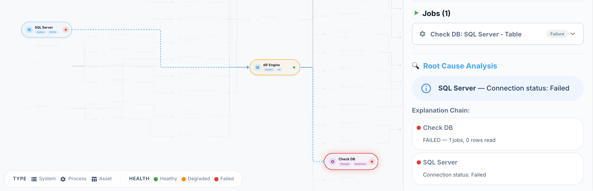
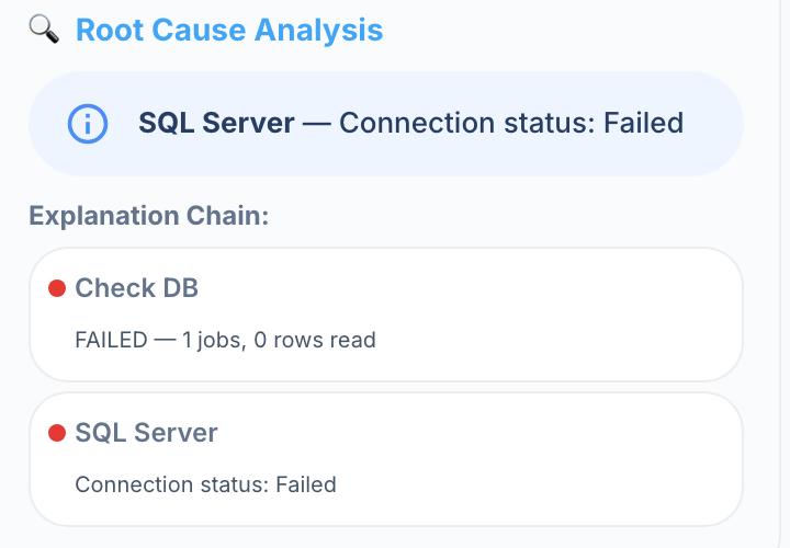
Someone opens the Control Tower, clicks the red node, and reads a sentence:
Four hops. One click. The cause was two systems away and happened before anyone noticed the symptom.
That sentence is not a guess. It’s the output of a deterministic algorithm you can read in about ninety seconds. Here it is.
Root cause is a dependency problem
Every data platform is a directed graph, whether or not anyone has drawn it.
Sources feed replication jobs. Replication jobs feed warehouses. Warehouses feed transformation models. Models feed dashboards. Orchestrations sequence the whole thing.
When a node fails, the cause is — overwhelmingly — somewhere upstream of it. Not always. But often enough that “look upstream, rank what you find” is the right first move, and it’s exactly the move a senior engineer makes by hand while five other people are opening five other tools.
So we made the machine do that move.
The algorithm, in plain English
Five steps. No model, no training data, no black box.
- Detect. A node reports a failure — a job fails, a connection stops responding, a check fires.
- Traverse. Walk upstream through the dependency graph, breadth-first, up to five hops.
- Score. Rate every upstream node on three things: how bad it looks, how recently it went bad, and how close it is to the failure.
- Rank. Sort by score. The top node is the root cause. Everything else with a non-trivial score is a contributing factor.
- Explain. Build a human-readable chain from the symptom back to the cause.
That’s it. That is the entire “intelligence.”
Here are the actual weights
Most vendors would stop at “our engine analyzes upstream dependencies.” I’d rather show you the formula, because the formula is the point.
Each upstream node gets a score:
score = severity × 0.5 + recency × 0.3 + proximity × 0.2
Severity — how unhealthy is the node? A failed node scores 1.0, a degraded node 0.6, an unknown state 0.2, a healthy node 0. If the node has emitted signals in the last two hours, the worst signal can raise this: a critical signal counts 1.0, a warning 0.5, an informational one 0.1.
Recency — how recently did the node go bad, relative to the failure we’re diagnosing?
| Signal age | Recency score |
|---|---|
| ≤ 5 minutes | 1.0 |
| ≤ 30 minutes | 0.7 |
| ≤ 1 hour | 0.4 |
| ≤ 2 hours | 0.2 |
| older | 0 |
Proximity — how close is it in the graph? A direct parent scores 1.0. A grandparent 0.7. Then 0.5, 0.35, 0.2. Beyond five hops we stop looking.
Severity carries half the weight because a failed upstream node is the strongest evidence there is. Recency carries less, because platforms are noisy and a warning from ninety minutes ago is often a red herring. Proximity carries the least, because the real cause is frequently not the direct parent — it’s the thing behind the thing.
Why weights and not a model
I want to be direct about this, because “AI-powered root cause analysis” is on every observability vendor’s homepage this year.
We chose graph traversal plus a weighted heuristic over a model for four reasons.
It’s explainable. When the engine says the source connection is the root cause, it can tell you why: failed state, signal fourteen minutes ago, three hops upstream. An operator can check that reasoning in seconds. A model gives you a confidence score and a shrug.
It’s deterministic. Same graph, same signals, same answer — every time. When you’re writing the incident review on Tuesday, the analysis from Monday still holds. It didn’t drift because the model was retrained or the prompt changed.
It needs no training data. Most platforms don’t have a labeled history of incidents with confirmed root causes. They have Slack threads. A model trained on nothing is a model that hallucinates a cause, and a confidently wrong root cause is worse than no answer at all.
It’s debuggable. When it gets the answer wrong — and it will — you can see exactly which term pushed the wrong node to the top, and you can fix the weight. Try doing that with a fine-tuned model at 2 a.m.
There’s a place for machine learning in operations. Anomaly detection on metrics is a good one. But ranking upstream failures by severity, recency, and distance isn’t a prediction problem. It’s a sorting problem.
The output is a sentence, not a heat map
This part matters more than the scoring.
The engine doesn’t hand you a graph with sixty nodes coloured by score. It hands you a chain — starting at the symptom, walking back through every failed or degraded node in order, ending at the root cause. Each step carries the node’s own explanation of what went wrong.
Then it does one more thing: it walks downstream from the symptom and lists what’s now affected.
So the answer to “why did it break?” arrives together with the beginning of the answer to “what’s affected?” — which is the next piece in this series.
Where does the graph come from?
Fair question. This whole approach is worthless if someone has to draw the graph by hand, because nobody will keep it current.
Nobody draws it. The graph is derived.
Every connection, job, orchestration gate, and lineage record the platform already knows about is synced into the causal graph automatically, on every scheduler tick. The topology is always source → engine → target, and the assets a process produces sit downstream of it. Add a job, the graph grows. Retire a connection, the graph shrinks. It’s idempotent, so running it twice is harmless.
Which means the operational context that the first article said was missing — the relationships — turns out to be sitting in configuration you already maintain. It just needed to be connected.
Where it’s honest about its limits
A tool that’s never wrong is a tool that’s lying. Here is where this one stops.
- It only ranks what’s in the graph. If the real cause is a cloud region outage, a network change, or an expired credential nobody modelled as a node, the engine reports no root cause rather than inventing one. That’s the correct behaviour, and it’s still a gap.
- Two hours is a window, not a law. A slow-burn cause — a disk filling up since Friday — scores zero on recency and can lose to a fresher, louder, less relevant node.
- Scores can tie. Two failed parents of the same age at the same depth will score identically. The engine returns both; a human picks.
- Five hops is a ceiling. Deep enough for most platforms we’ve seen, but a long chain can outrun it.
None of these are hard to close. All of them are things I’d rather say out loud than let you discover during an incident.
The claim, restated
The first article said: visibility isn’t understanding.
Understanding, it turns out, doesn’t require a large model. It requires the one thing dashboards structurally lack — a graph of how the pieces depend on each other — and a small, transparent rule for walking it.
Root cause is a graph problem.
Treat it like one.